
A.W. Tozer • Coleção Vida
Editorial Design / Book Covers
Editorial Design / Book Covers
pt.
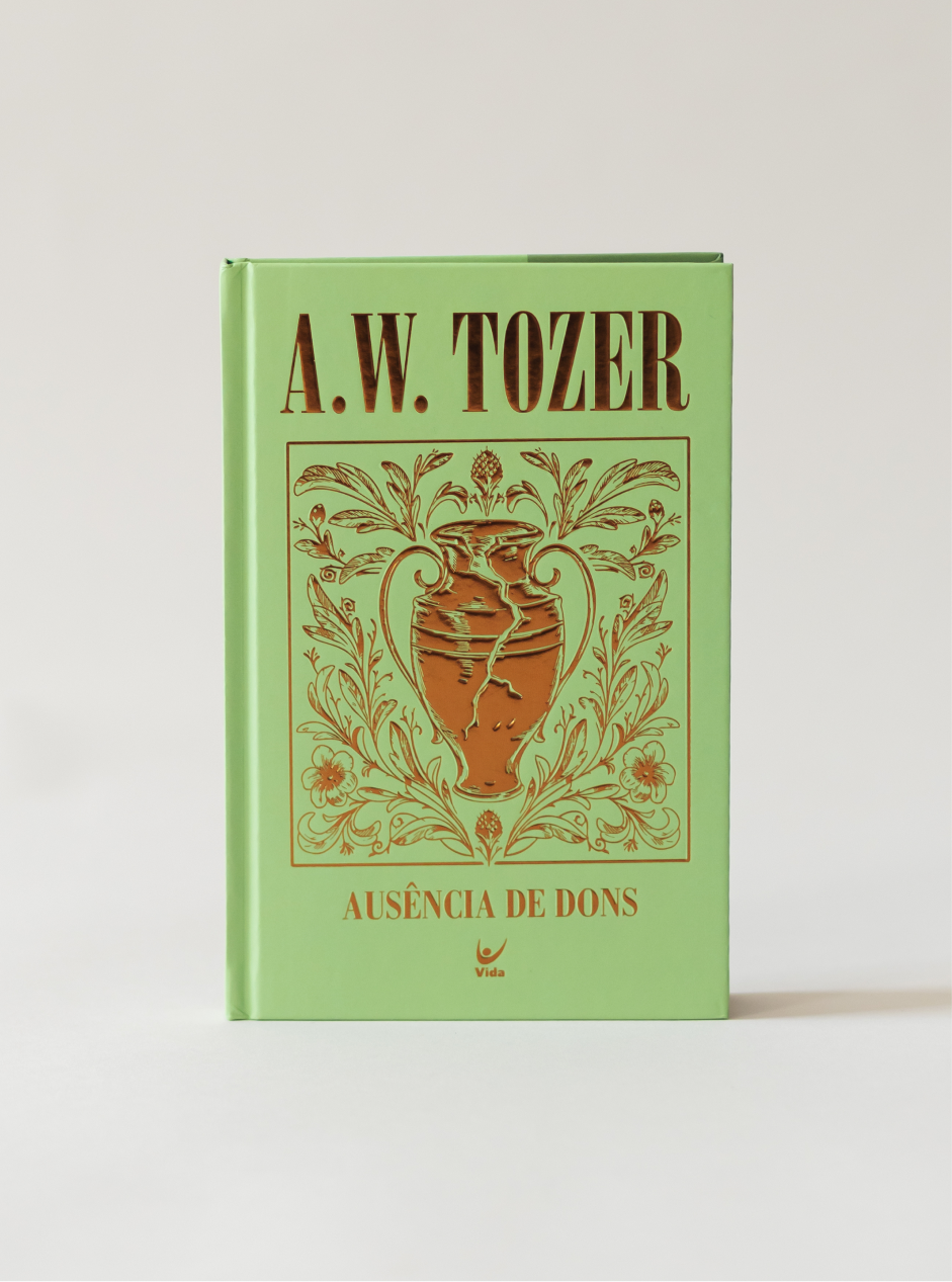
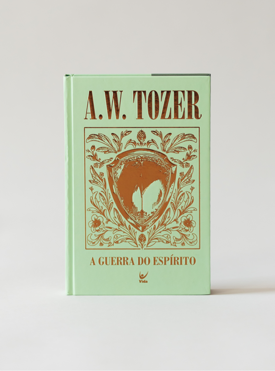
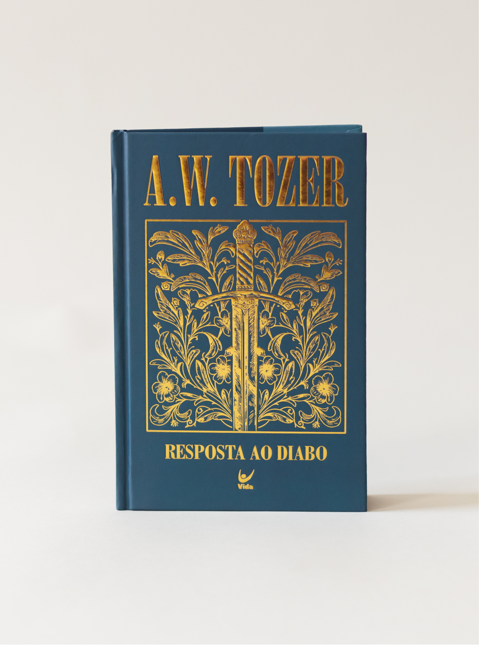
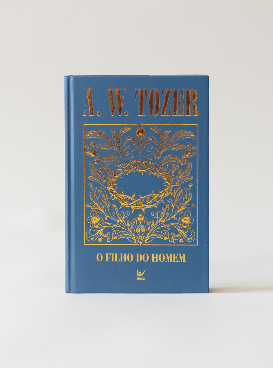
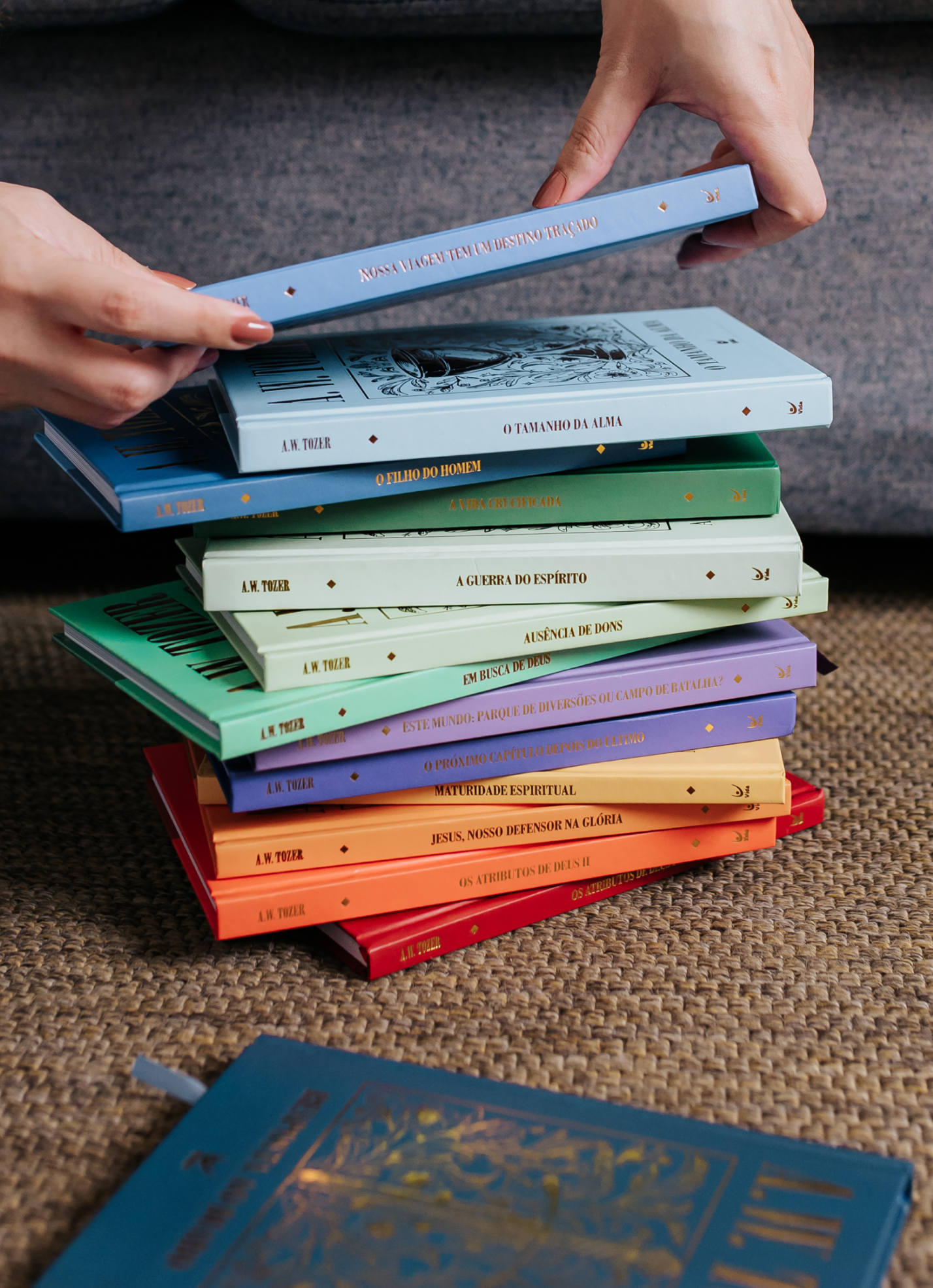
A.W. Tozer foi um pastor americano do século XX que escreveu sobre Deus com uma simplicidade que incomoda (no bom sentido). Seus sermões e livros atravessaram gerações porque falam de fé sem enfeite. Fizemos a coleção para a Editora Vida, e o desafio foi dar a quatorze livros uma cara só, em uma coleção que pudesse ser lida volume por volume e reconhecida como um conjunto na estante.
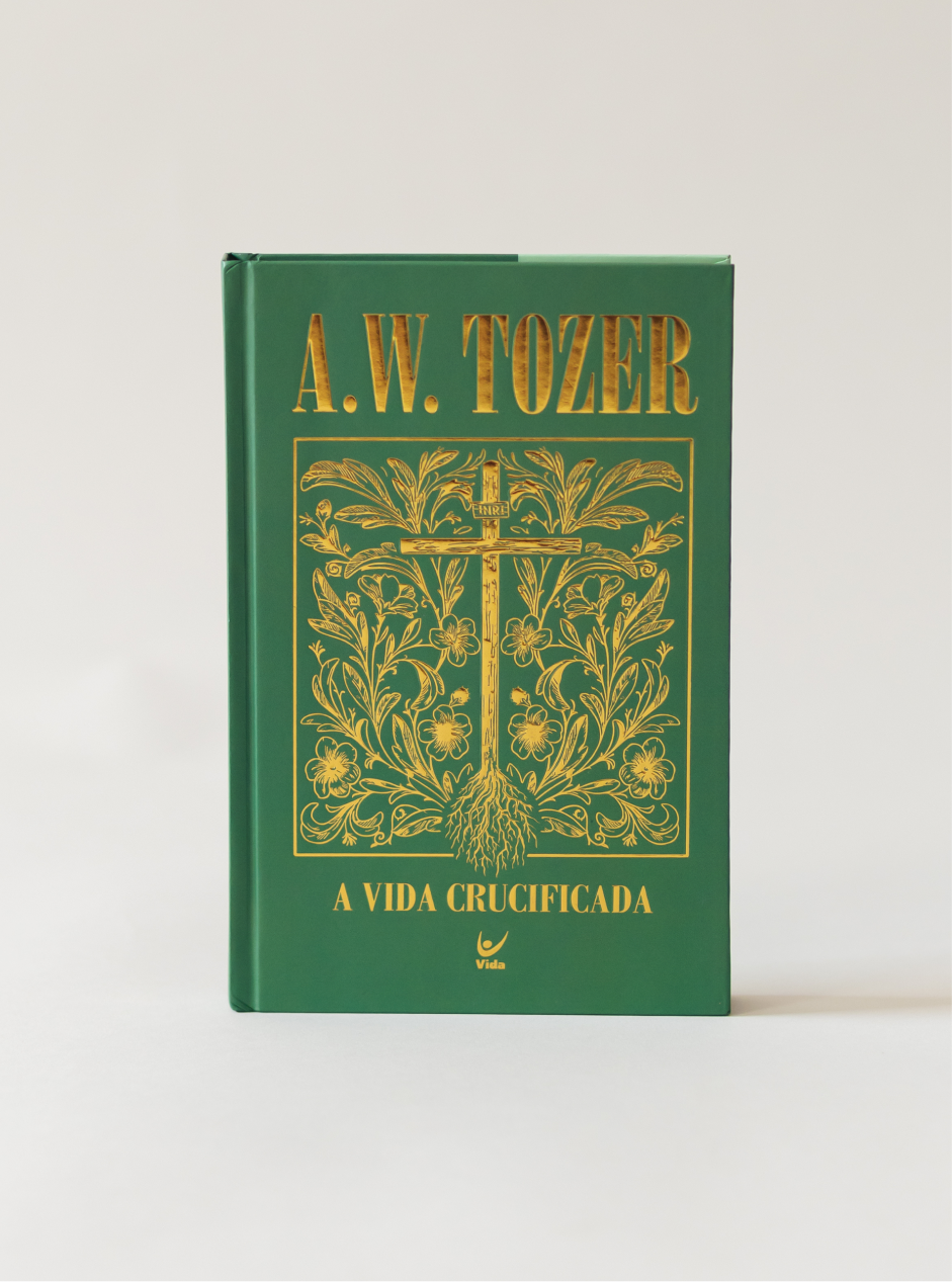
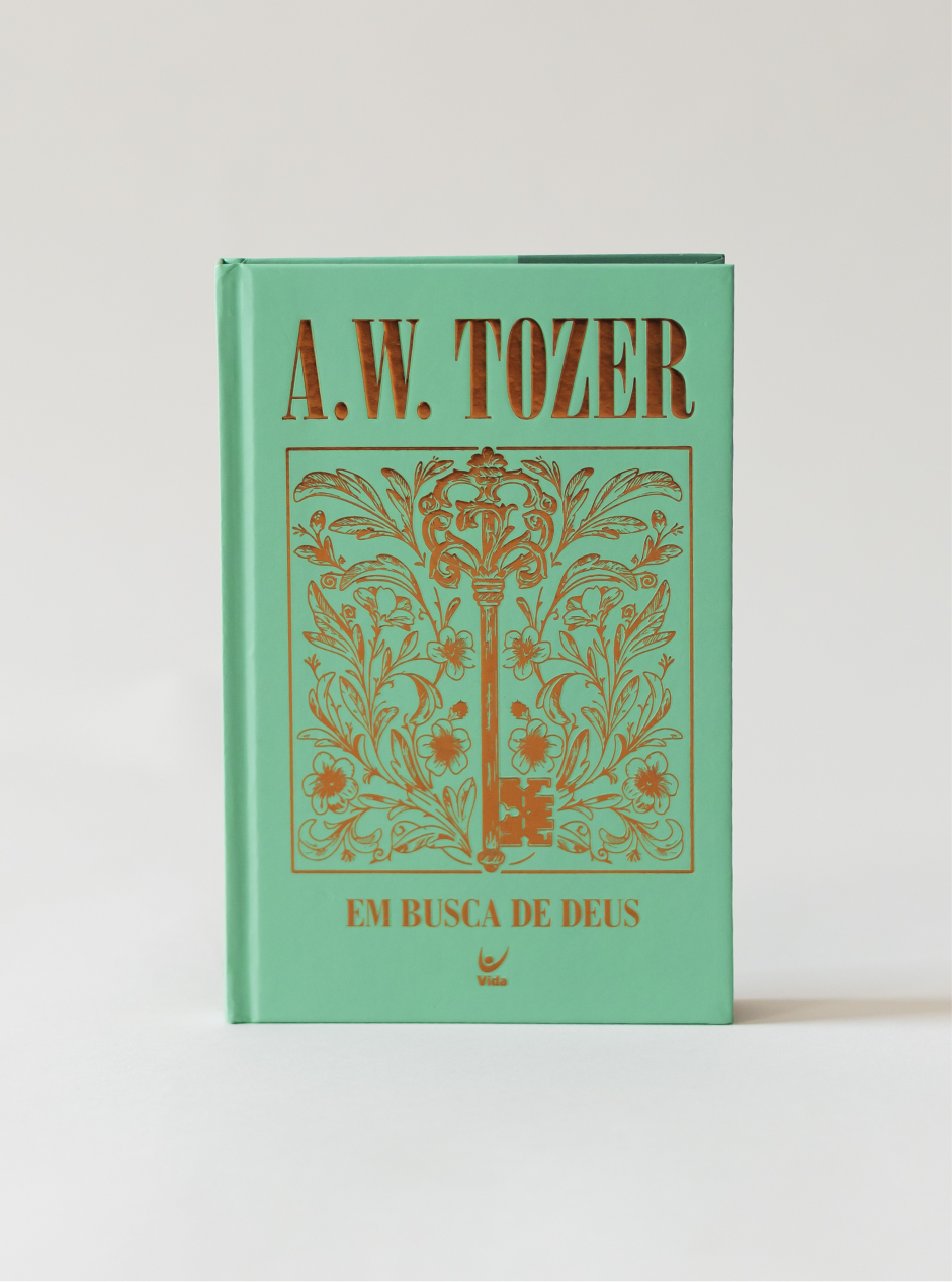
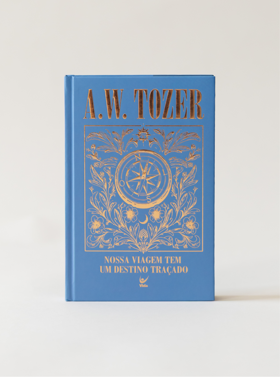
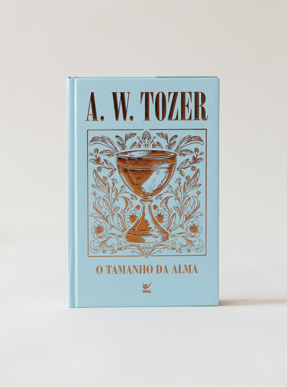
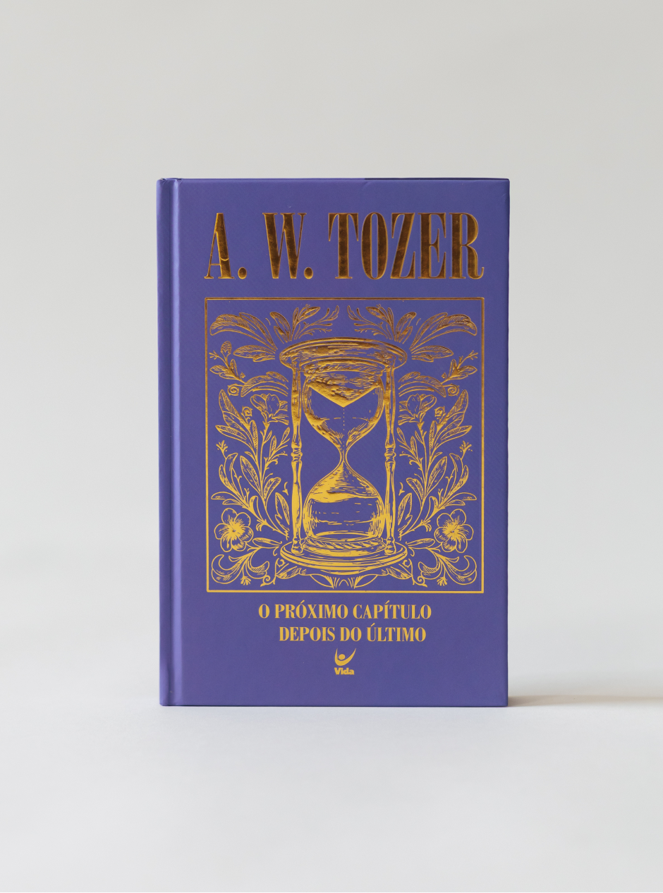
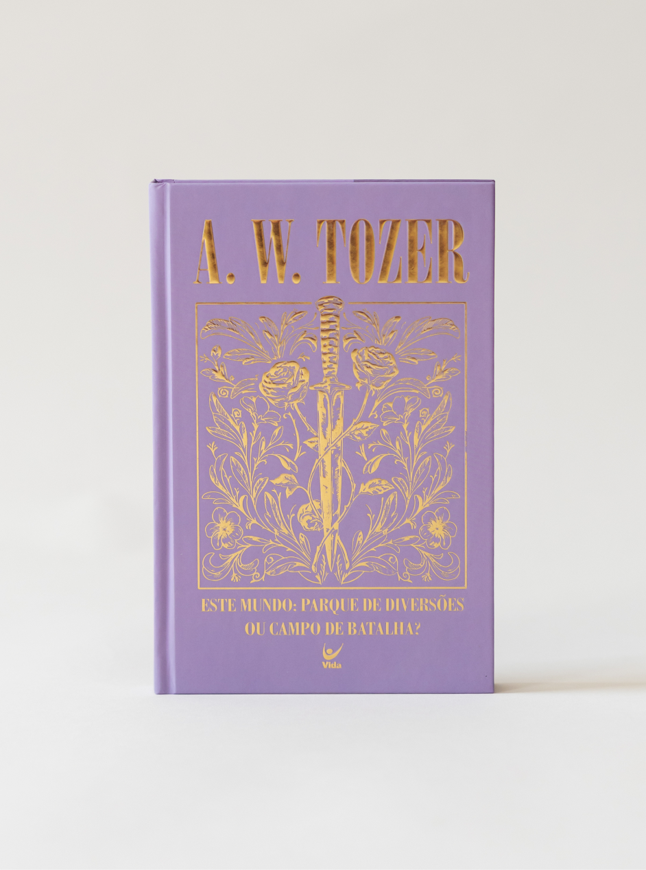
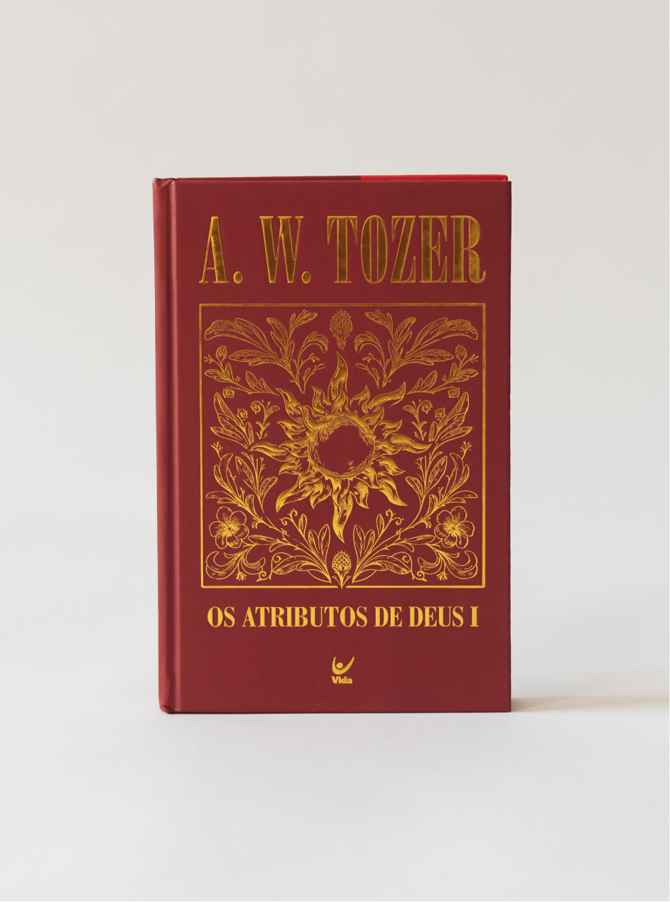
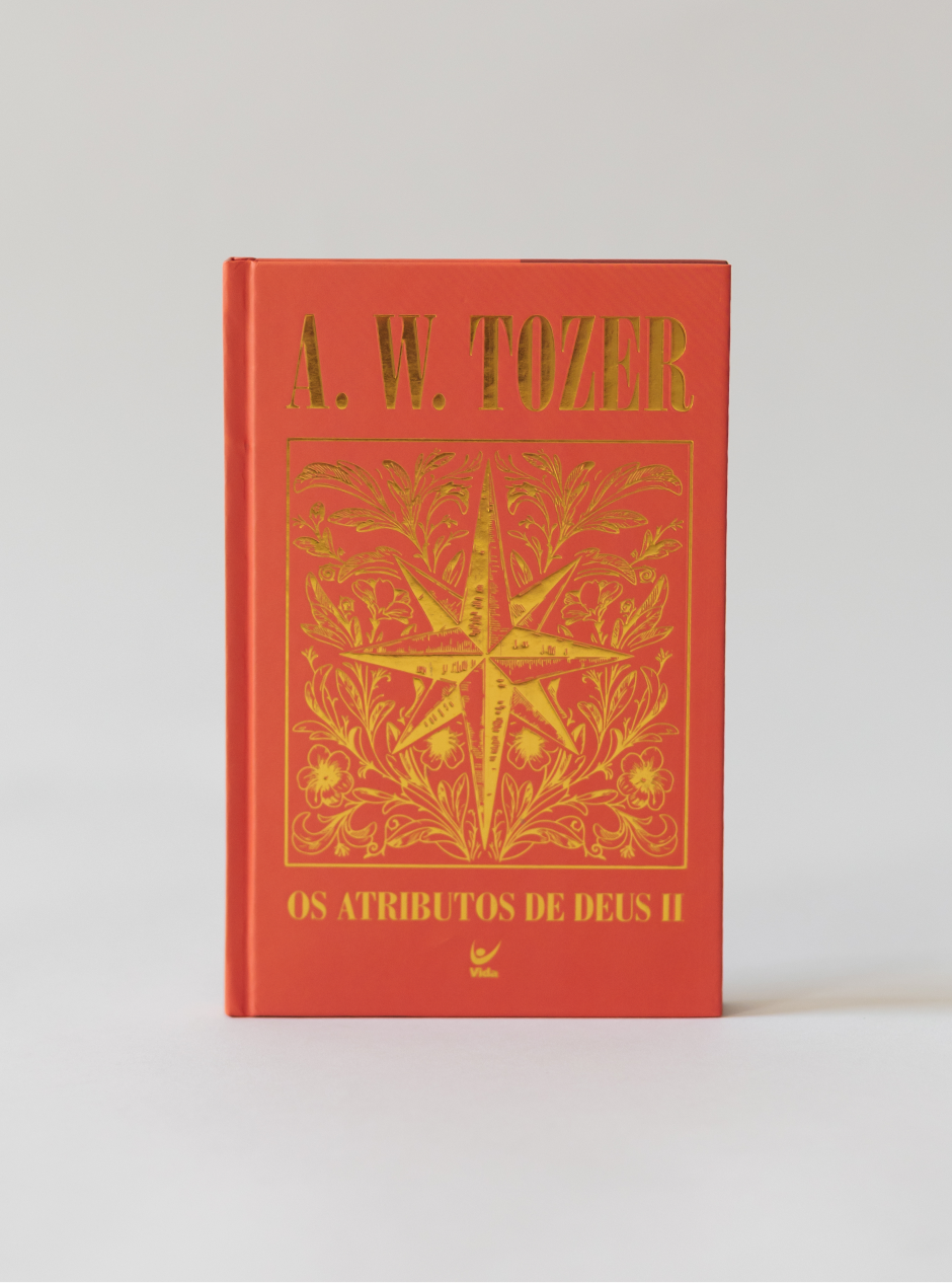
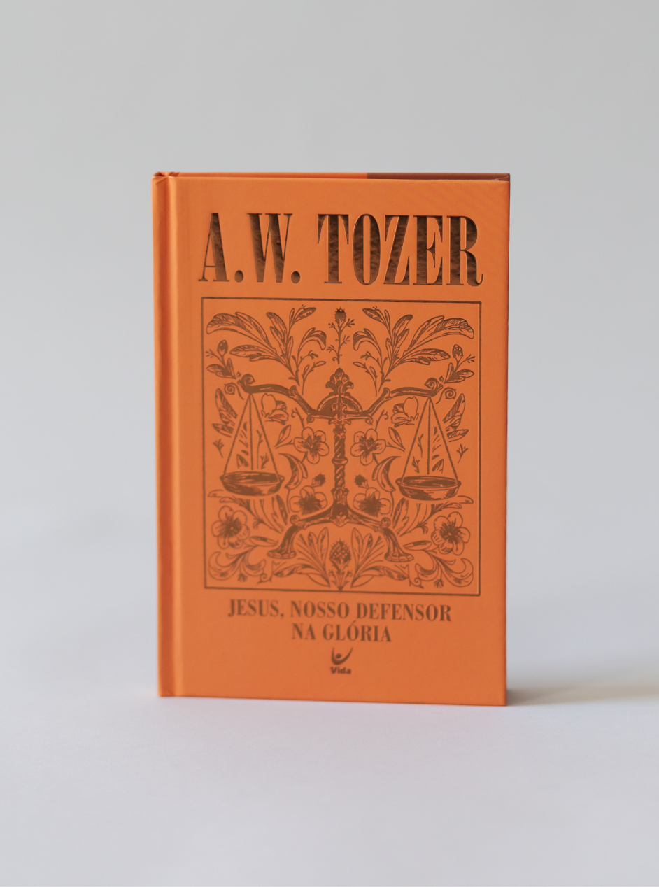
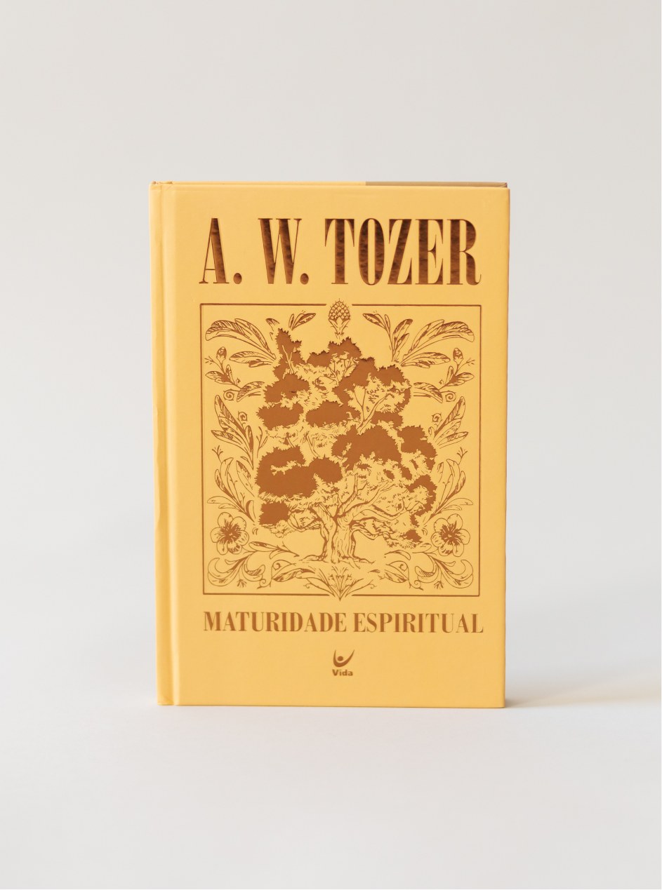
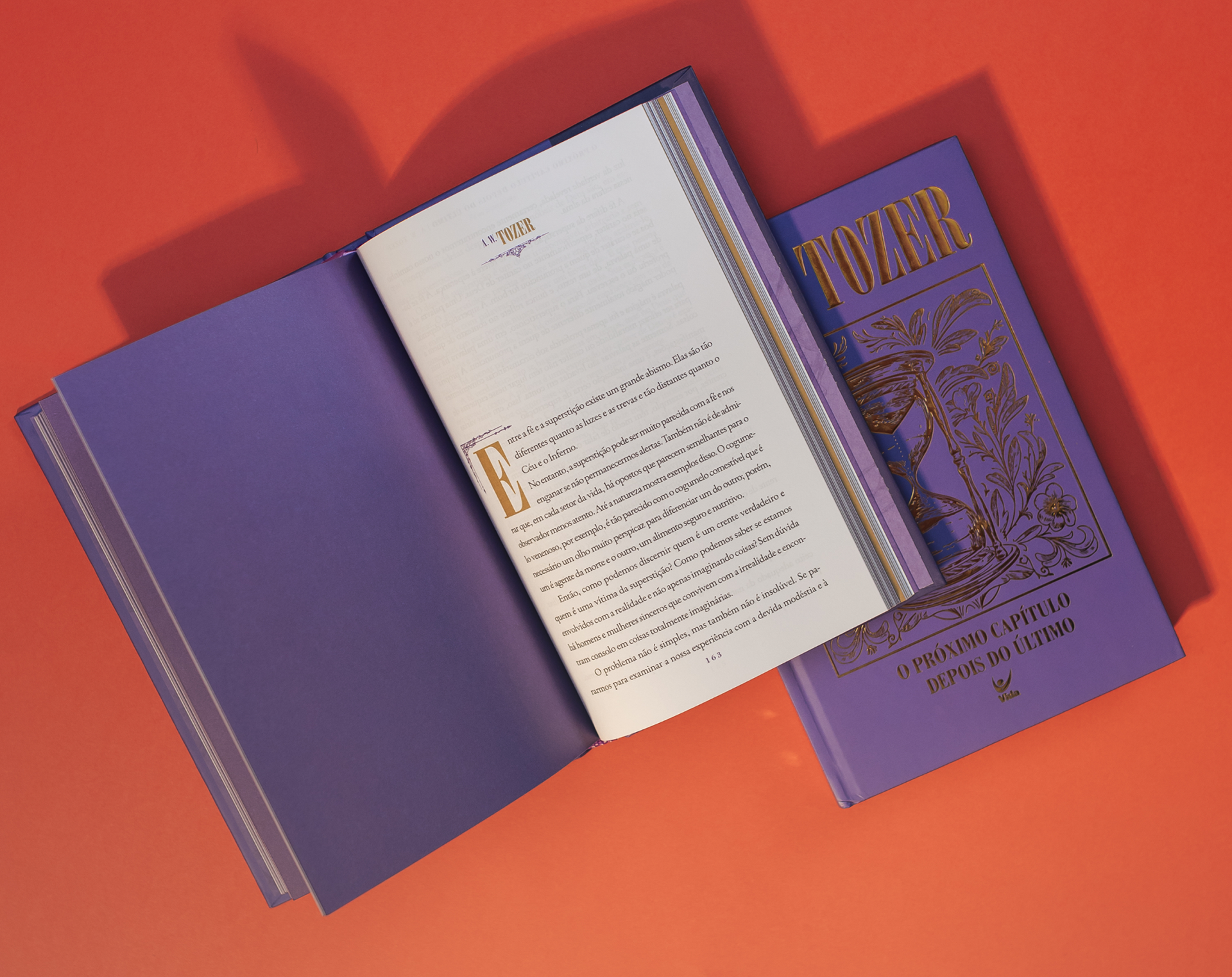
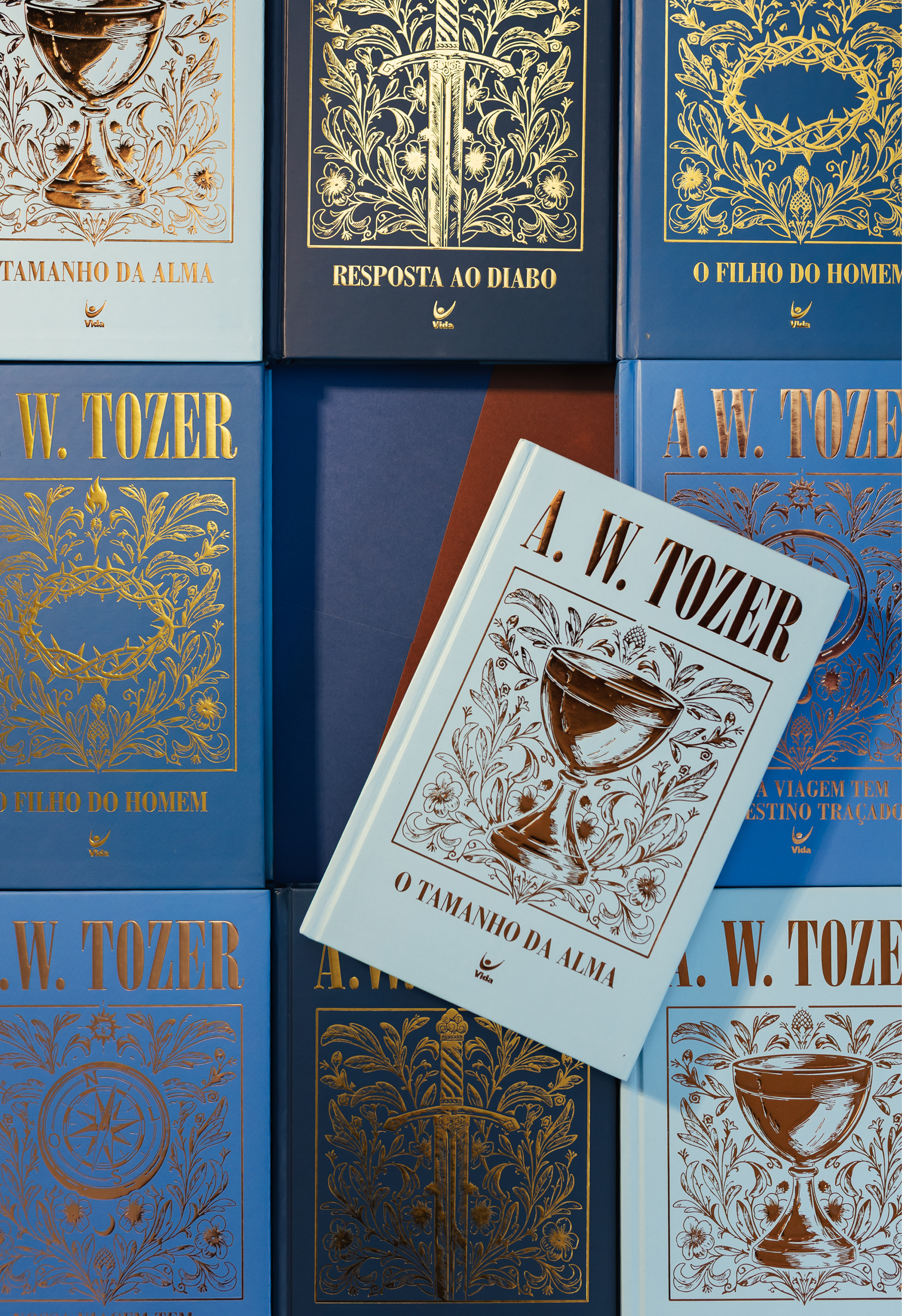
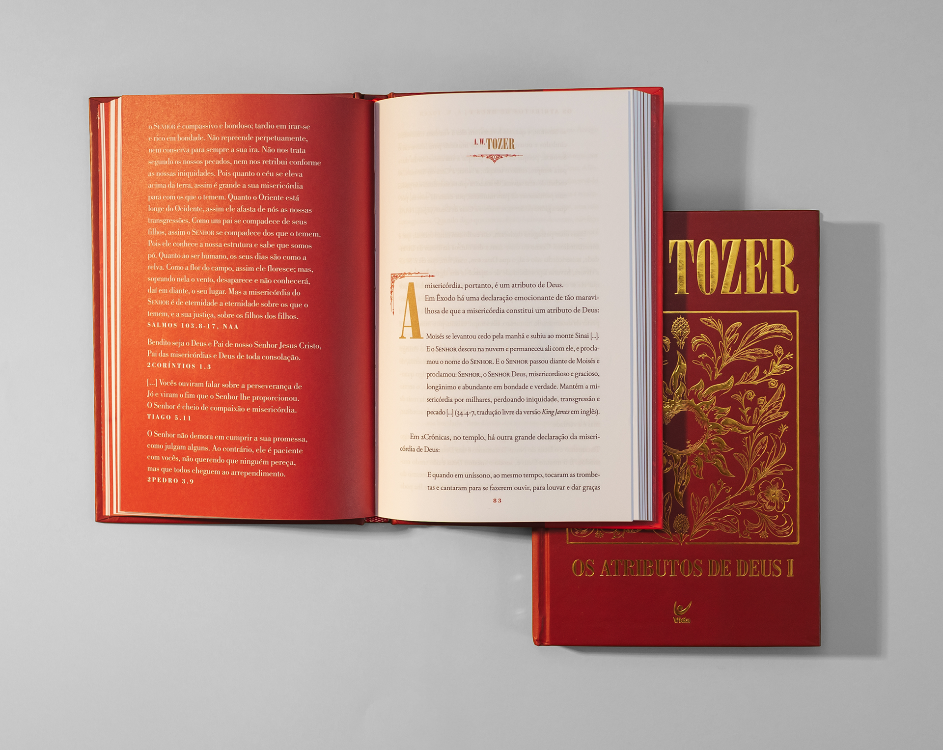
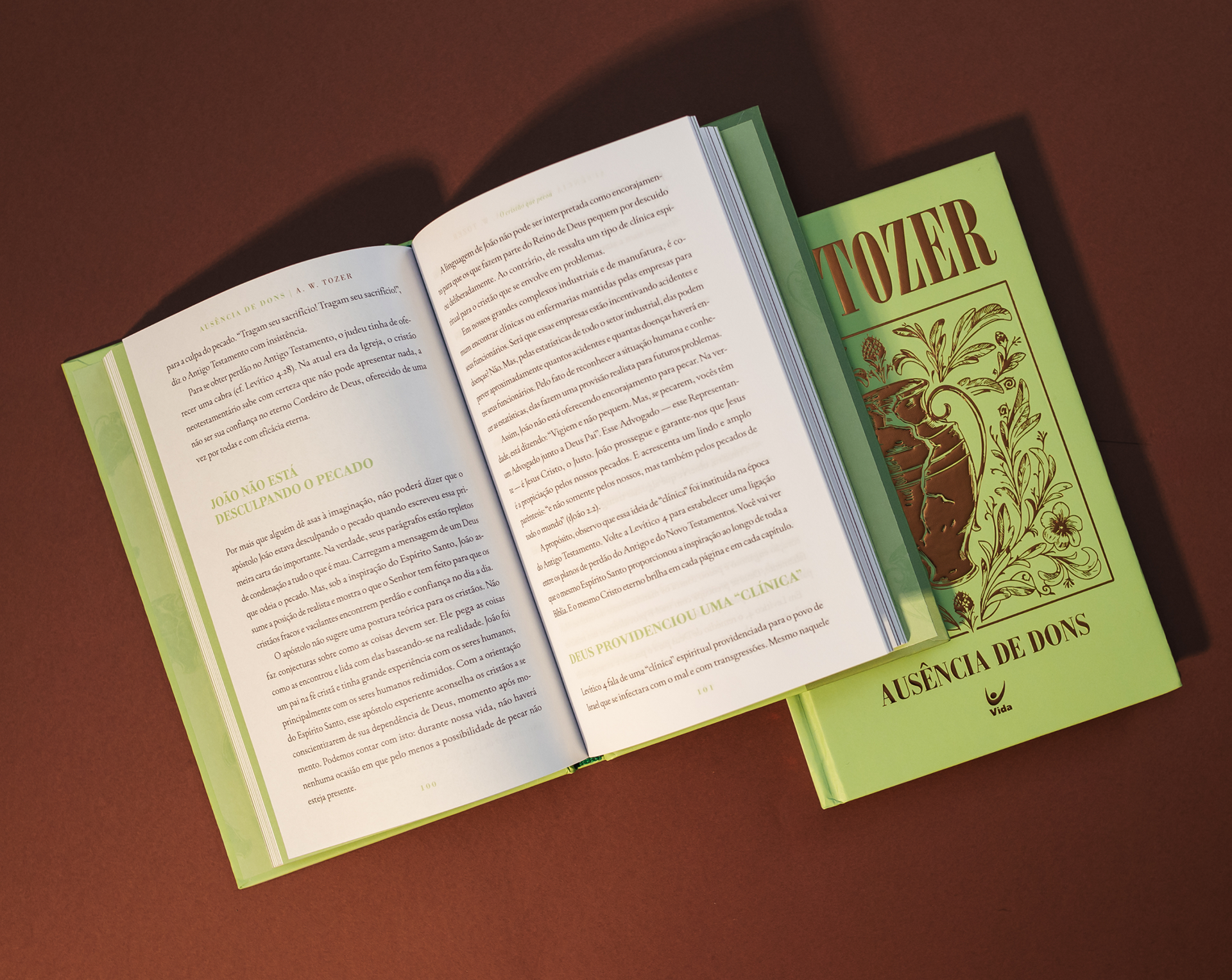
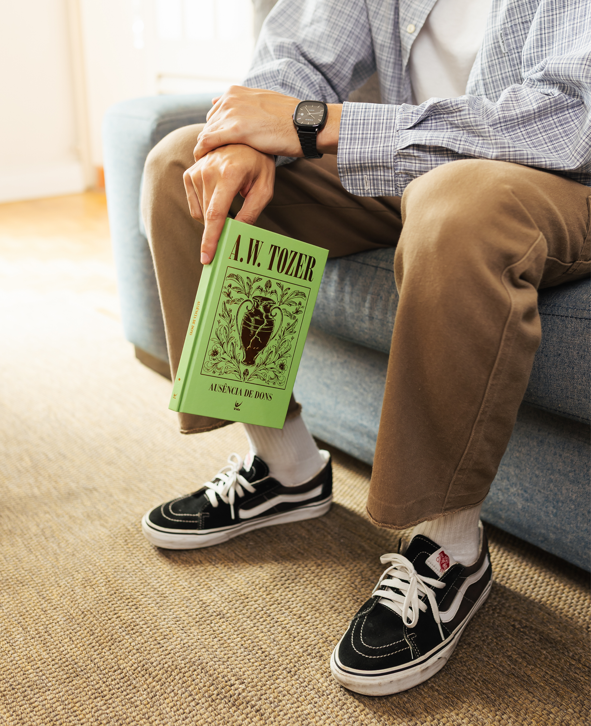
Cada capa carrega um símbolo que traduz o próprio título do livro: o sol para os atributos de Deus, a rosa dos ventos para o caminho, e assim por diante. Fizemos ilustrações em estilo engraved, que conversam com a tradição dos livros antigos, e trabalhamos molduras ornamentadas que se repetem e amarram a coleção.
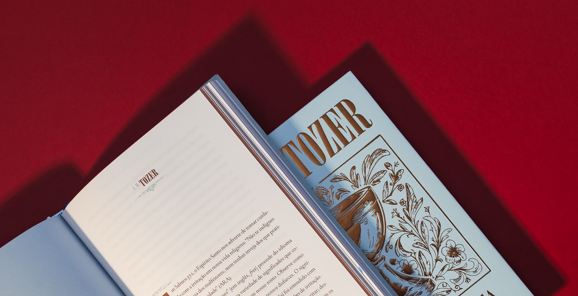
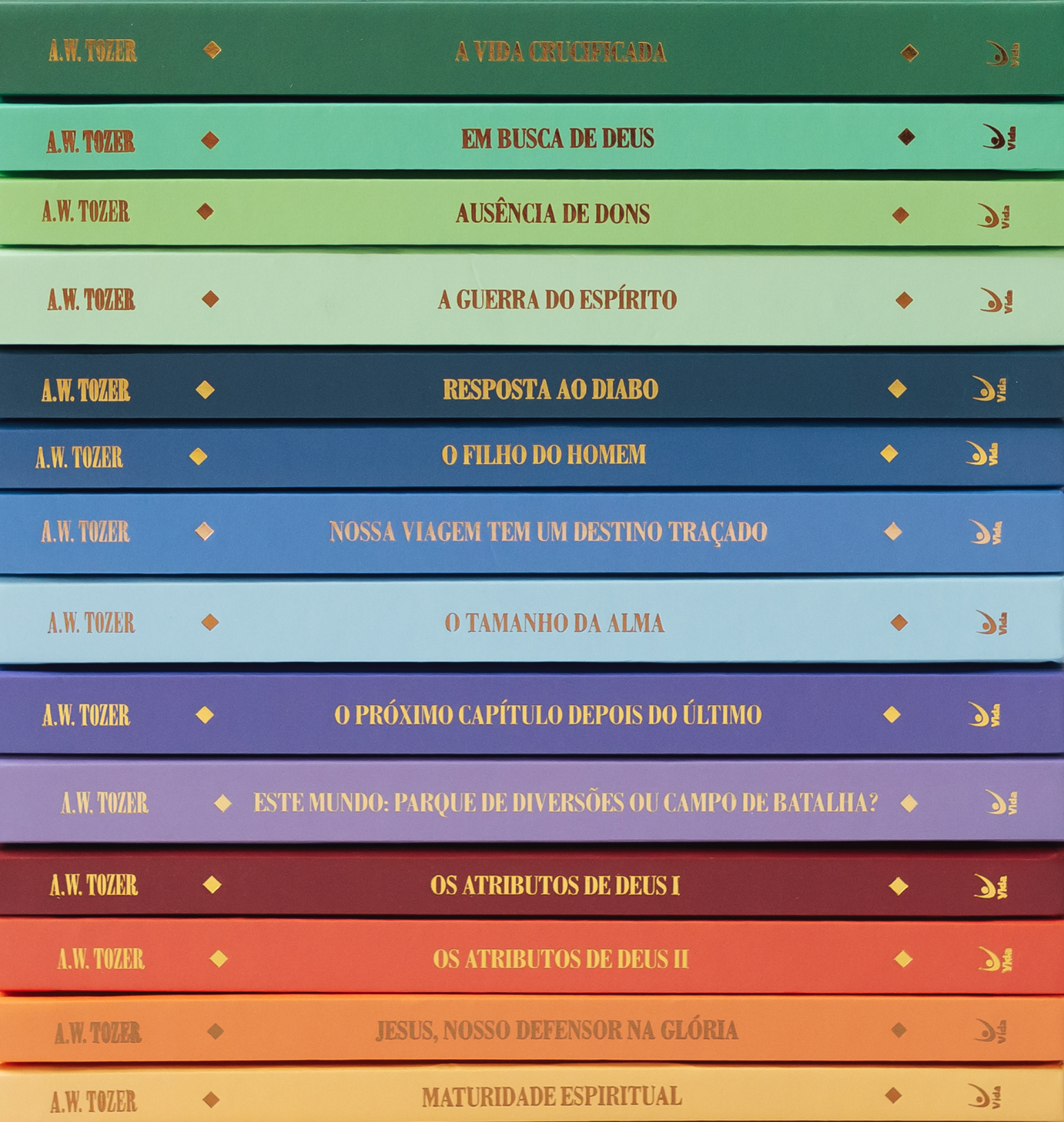
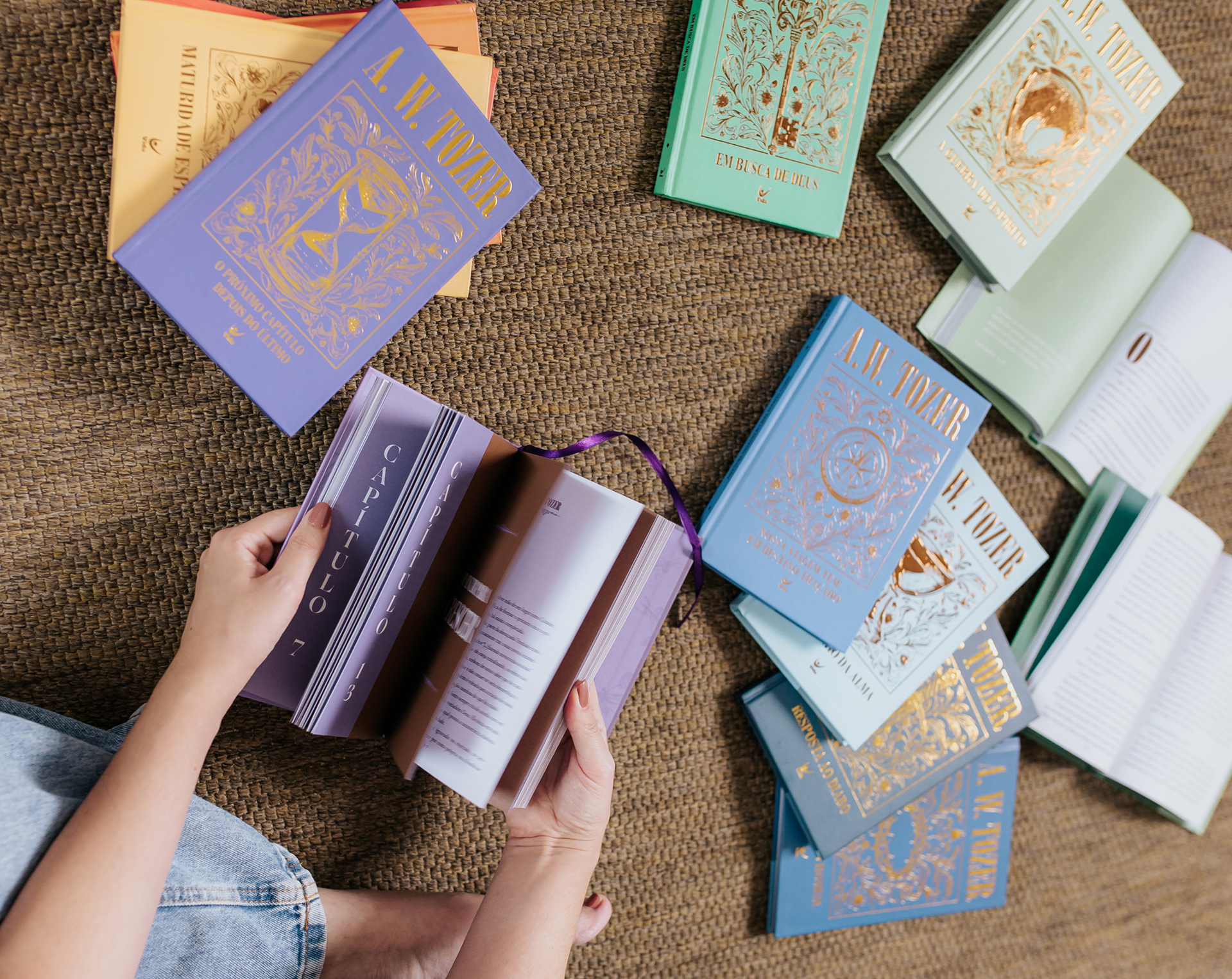
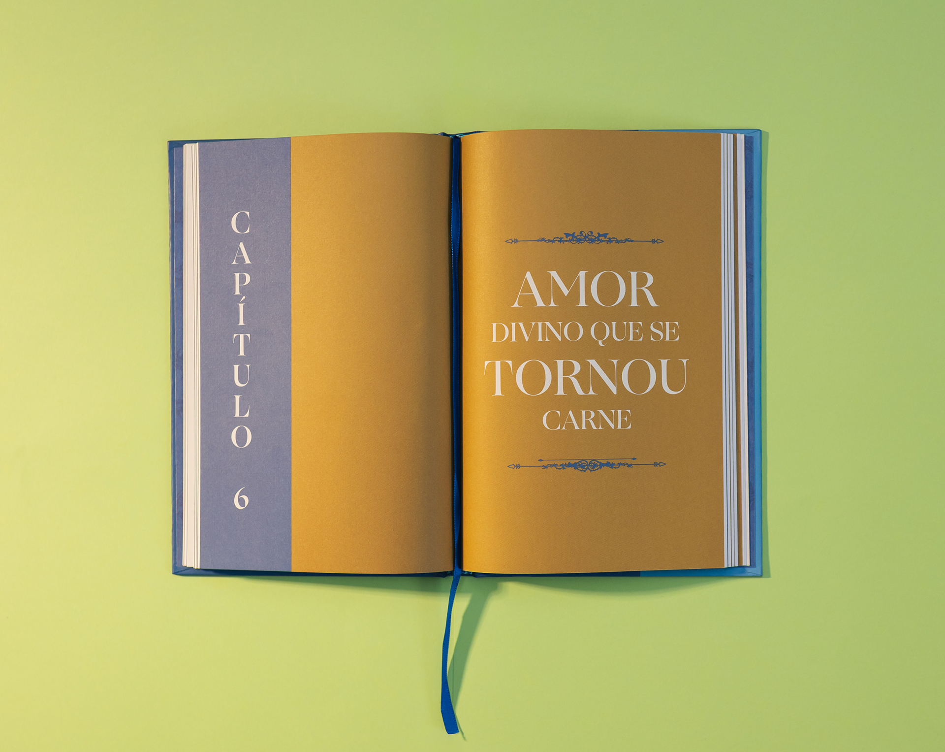
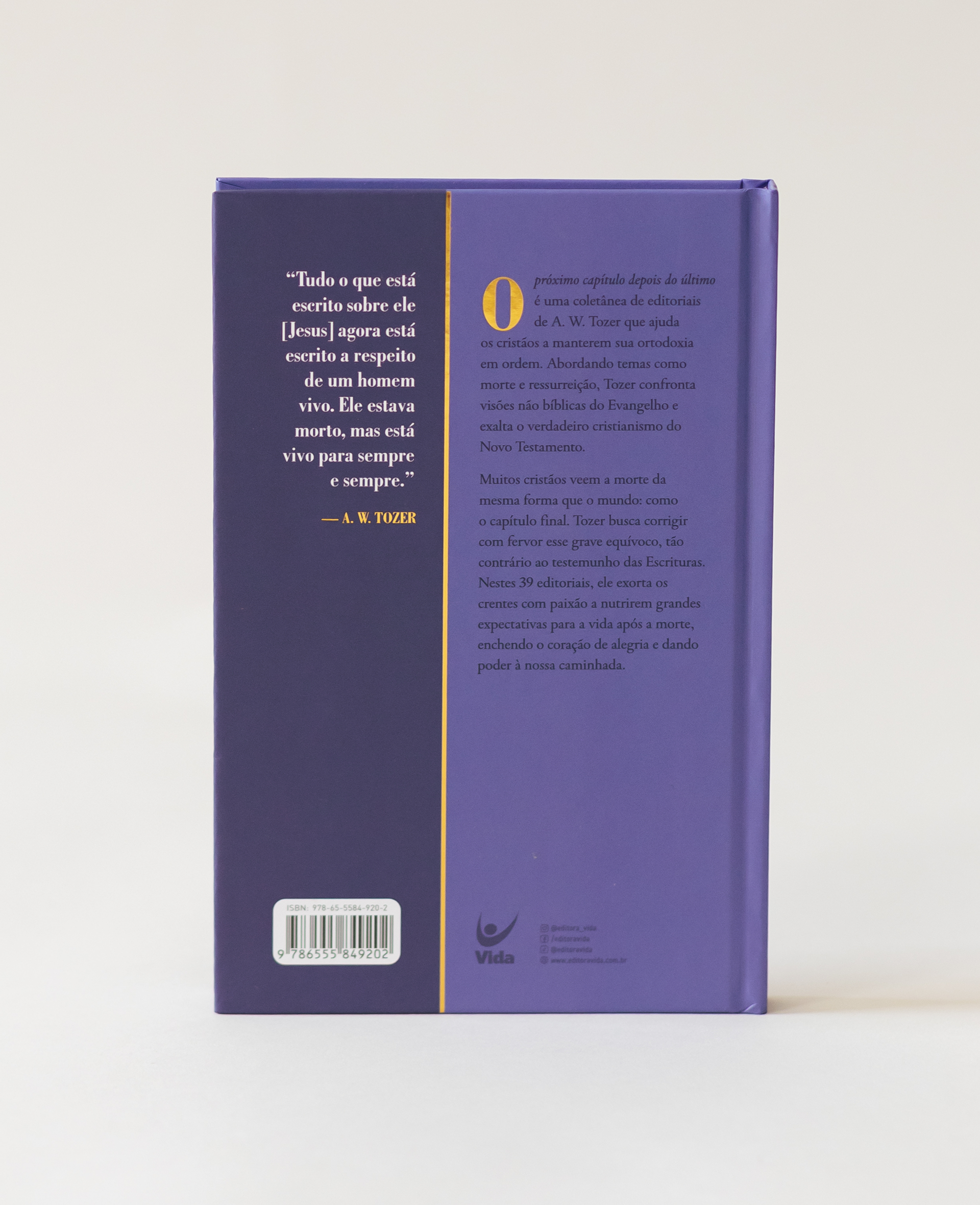
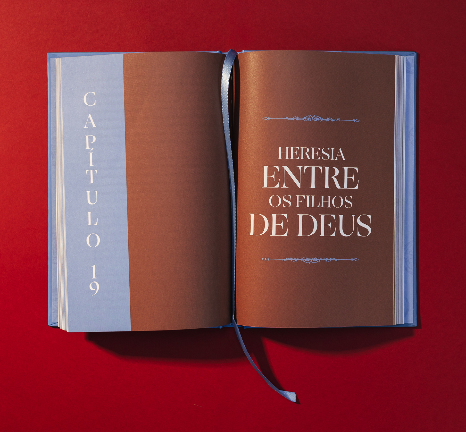
Cada título ganhou uma cor e, juntos, eles formam um degradê que vai do verde ao amarelo, passando por várias cores e tons. As lombadas seguem a mesma estrutura. O miolo continua essa linguagem nas aberturas de capítulo, com capitulares e ornamentos que trazem o acabamento da capa para dentro da leitura.
Uma coleção pensada para ser lida devagar, guardada com cuidado e passada adiante.
Livros que pedem tempo, num tempo que quase não tem.
Livros que pedem tempo, num tempo que quase não tem.
en.
A.W. Tozer was a 20th century American pastor who wrote about God with a simplicity that unsettles (in a good way). His sermons and books have crossed generations because they speak of faith without ornament. We designed the collection for Editora Vida, and the challenge was to give fourteen books a single identity, in a collection that could be read one volume at a time and recognized as a whole on the shelf.
Each cover carries a symbol that translates the book's own title: the sun for the attributes of God, the compass rose for the journey, and so on. We created engraving style illustrations that echo the tradition of classic books, and developed ornamental frames that repeat across every cover and tie the collection together.
Each title received its own color and, together, they form a gradient from green to yellow, moving through a range of colors and tones. The spines follow the same structure. Inside, the chapter openings carry the same language, with drop caps and ornaments that bring the finish of the cover into the reading experience.
A collection made to be read slowly, kept with care and passed on.
Books that ask for time, in a time that barely has any.
Books that ask for time, in a time that barely has any.


Dito - Estudio de Design
Para solicitar um orçamento clique aqui
Diretor de Arte: Lira
Team: Artur Rocha
Team: Artur Rocha
Diagramação: Claudia Lino
Fotos: Lua Lima
Editora: Vida